On this page
A company website is often judged by the first screen. That is a useful test of clarity, but not a sufficient test of design. We want zortex.me to support a reader who moves from a headline into a long explanation, compares several articles, follows a source and returns later on a smaller screen.
The current site is a server-rendered publishing application. White reading surfaces, dark text, muted metadata and restrained interaction leave room for an article's argument rather than turning every section into a visual effect. It has a separate authenticated studio for editing and publication. The public design and the editorial system are related, but they do not have identical requirements.
White space is part of the hierarchy
The site's October 7 history records a choice to bring the homepage back to the light design used across the rest of the site. A full-page dark visual field had competed with the main invitation. The revised page keeps the headline, explanation and signup on white, while a concept preview occupies its own contained section.
That choice establishes a practical hierarchy. The page makes a claim in words first. Motion is supporting material, not the navigation surface or the only route to understanding the product.
Our type system uses Inter and a set of roles rather than treating every text size as an isolated decision. The published verification notes describe a 64-pixel header, body copy around 17 pixels with a 28-pixel line height, and smaller metadata separated visually from article titles. These measurements describe the checked-in website at that revision, not a rule that every Zortex product must adopt.
A line of explanatory text needs enough width to read comfortably, but not the entire viewport. A diagram or comparison needs more room. The article layout therefore has distinct spans for reading copy, title material, navigation and wider composed sections.
One content source, several reading contexts
An article begins as a Markdown file with YAML frontmatter: title, date, category, excerpt, imagery, author and body. The publishing system validates those fields, stores a public version separately from the draft, and renders the article on the server.
The reader then sees an article with a title, summary, date and category, a byline, a computed reading-time estimate, an optional cover, and a contents list when the body has headings. The journal has search, filters, order choices and alternate presentation modes. Those are distinct ways into the same source material.
The basic flow is:
Versioned Markdown article
            |
            v
Schema and publication state
            |
            v
Semantic server-rendered page
            |
            v
Search, reading and sharing controls
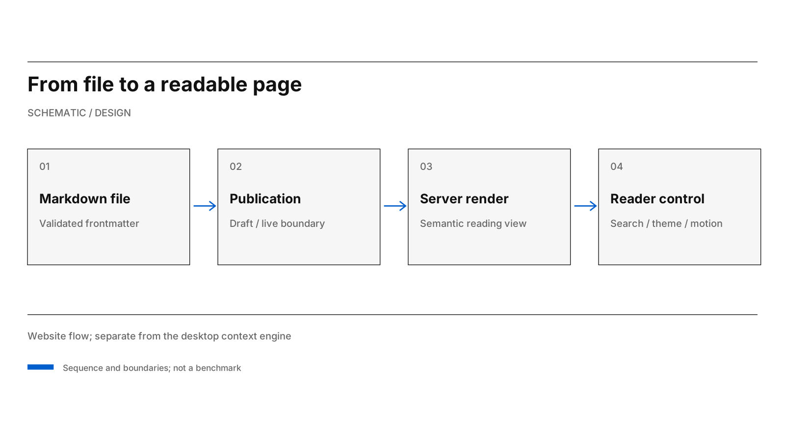
One article source flows through publication state into the reader's page and discovery controls.
This diagram is a description of the website, not of the desktop world-model engine. A publication database and an AI context vault solve different problems and have different security boundaries.
Responsive means allowing content to change
A fixed screenshot can conceal weak rules. A long title changes line breaks; a table needs more width than a paragraph; a user can increase their default font size; a journal category might be substantially longer than the examples used while designing.
The site testing record retains cases where long text first caused overflow. The response was not to hide the entire document outside the viewport. It was to let intrinsic layout containers shrink correctly, wrap metadata when necessary and keep tables and code blocks scrollable within their own region.
This is what we mean by a design language. The rule is not simply a measurement such as a 32-pixel gap. The rule is the relationship between the element, its content and its container, including what must happen when the content no longer fits.
The same idea applies to image descriptions. A cover should have an alternative text description that says what appears in the visual. A decorative motion clip should not be required to understand the article. A video that has no usable still frame is not a complete reading experience.
Motion, restraint and reader control
The publishing UI supports motion covers and media sections. The JavaScript media governor controls which clips are attached and allowed to play; the site also offers reduced-motion behavior and still posters for readers who need or prefer them.
The verification record reports browser measurements for the media governor on one machine, with a budget on simultaneous playback. It does not make those laboratory values a promise of frame rate on every device. Our design commitment is the simpler one: avoid unnecessary decoding and never make moving content the sole bearer of meaning.
Site preferences include a light/dark theme and a journal hide-images setting. The light presentation is the primary visual reference for these posts, but honoring a reader's stated preferences matters more than preserving one screenshot.
We use thin rules, restrained colour and generous whitespace in diagrams for a similar reason. A chart is meant to isolate a relationship. It should not compete for attention with the claim it is supposed to explain.
A publishing boundary is part of design
The studio makes revisions possible without silently changing a live page. A working draft can be saved and reviewed while the public version remains stable. Publication is explicit, and the repository content is reconciled through the seed process.
That has visible consequences. An article must have a stable URL, appropriate metadata and images that load. Search and navigation should not surface private drafts. A person who bookmarked a published explanation should not unexpectedly see an editor's unfinished note.
Those are information-design properties, even though their implementation lives in server code and persistence tests. Design is responsible for what the system communicates, including the absence of content that has not been published.
Editorial states belong in the interface
The site's browser checks exercise article rendering, editing boundaries, long text, narrower viewports and media behavior. Accessibility review also has to account for assistive technology and actual device settings; a screenshot cannot test those interactions.
The article renderer now accepts SVG diagrams in nested local asset directories. Covers and inline diagrams use validated /static/assets/ paths, and the publishing tests check that rendered images have alternative descriptions and resolve successfully.
The point is a publication surface that preserves the distinction between draft and publication, gives evidence space to develop and remains readable as topics and content change.
Source basis: ZortexHQ/zortex-site app/static/interface.css, tokens.css, app/markdown.py, app/schemas.py, app/templates/article.html, README and docs/TESTING.md; October 7 homepage design commits. Earlier measurements are cited as historical verification records, not newly executed results.