On this page
A context system has an unusual design problem: it may know about many sources, but the person using it usually needs one thing at a time. A screen that makes all available information equally prominent can be impressive as a demonstration and exhausting as a working tool.
Our app experiments in ZortexHQ/v2-demo explore two related surfaces. One is a set of MCP App cards for Zortex onboarding and the world view. The other is a wrapper around DeepSeek Harness, where the Zortex layer can coexist with a real AI host. They are useful design evidence precisely because they answer different questions.
The concept cards exercise hierarchy, pacing and the shape of a personal world. The wrapper checks how identity and the Abilities catalogue fit around existing host controls.
Start with the decision on screen
When a person asks a question, the first screen should answer a basic question of its own: what can I do here? If the assistant is gathering context, the interface should distinguish that activity from an answer. If it is blocked on authorization, the interface should say what needs attention rather than substitute a generic loading spinner.
The demo's card guidelines limit how many actions and data points compete inside an inline response. A card is not a miniature dashboard. It should provide a brief answer or state, one or two relevant actions, and a way to reach more detail only when the user needs it.
That constraint is visible in the conceptual onboarding sequence. The cards show linking and processing states before offering a world preview and a separate window. The larger visualization is not forced into every response. A question can remain in the host conversation even when the underlying system has a richer visual surface.
The same principle should apply to real connectors, though they require more honest states than the demo's scripted progression. The absence of a connection is not the same as a source waiting for indexing, or a provider requiring the person's next step.
The galaxy shows relationships and their sources
The galaxy experiments are part of the app's visual language. A constellation of related points can suggest relationships and give someone a way to explore a large world model without starting from a table. In the design lab, alternate graph, ink-galaxy and light-up studies explore whether that sense of structure can stay legible.
But a compelling visualization creates a risk: it can imply greater completeness than the data deserves. A dot can look definite even if the relationship is inferred. A beautifully animated cluster can imply everything is synchronized when part of a source is stale.
A real graph view needs to be able to answer where an entity came from, how recent the source is, and what selecting a point will do. Its motion should organize attention, not mask those questions.
A four-stage interaction
Our design test is less about the geometry of a star than about the journey through the interface.
Question in the AI host
          |
          v
Compact answer or status card
          |
          v
Optional world preview
          |
          v
Return to the host with the task intact
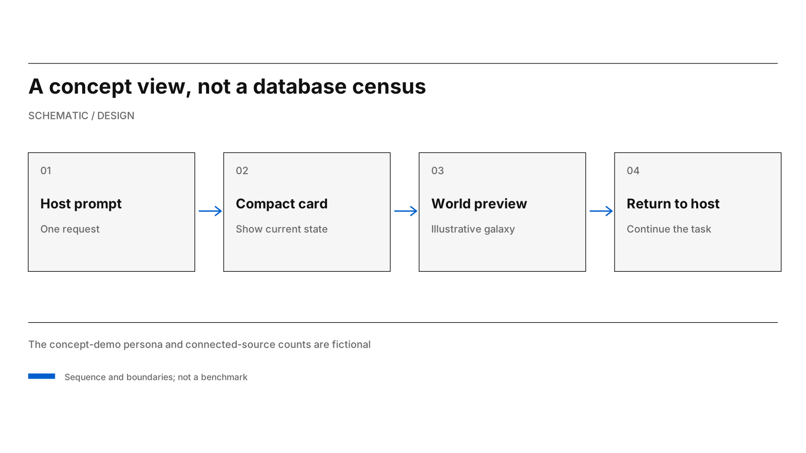
A compact response can open a larger world view and then return to the host conversation.
This sequence describes an intended handoff. Different hosts may support different combinations of embedded cards, browser windows and actions; it is not a promise that every AI tool renders the same view.
The important property is continuity. A user who explores a document relationship should be able to continue the original conversation. The demo's chat pill forwards a message into the host conversation rather than inventing a parallel assistant with a separate memory. This is a practical interface decision: it avoids splitting the person's work across two unrelated chat histories.
Respect the host
The DSH wrapper follows a complementary rule. Its CSS inherits the host's typography, surface colours and control conventions. It introduces Zortex's Abilities presentation and some identity changes, but it preserves native model selection, reasoning controls and the underlying interaction model.
That restraint is a form of product design. If someone is already working in a capable host, the context layer should add usefulness without making known controls harder to find. A custom skin that removes approvals, keyboard support or visible task history has taken something important away.
The wrapper can also be turned off with Alt+Z. This is valuable during prototyping because a designer can compare a modification with the original host without attributing every failure to the new layer. Reversibility makes evaluation more precise.
The accompanying design research asks for deliberate spacing, typography, alignment and purposeful motion. It explicitly rejects decorating the interface with borrowed cultural stereotypes or treating a fixed visual ratio as a rule without evidence. A style is useful when it improves comprehension under real content, not when it supplies an attractive story about itself.
Motion must earn its place
Animation can reveal sequence: which state completed, which item appeared, or where attention moved. It can also hide an unstable layout. A world view that constantly rearranges while someone is trying to inspect it is less useful than a still one.
The validation checklist covers reduced-motion behavior, keyboard focus, selection continuity, long names, narrow windows and large font settings. Each host test records the states it exercises.
The design criterion is simple: with motion removed, the interface should still communicate what the user can do and why the information is there.
What the interface must preserve
The lab argues for progressive disclosure and clear ownership of controls. Keep the short answer in the host; expand into the world view when the task needs it. Keep native permissions with the host. Let the person return without reconstructing the question. Mark example connections as demonstration data.
The design standard follows the task: distinguish observed from inferred links, show the original record, make authorization failures actionable and preserve the conversation when moving between surfaces. Those requirements guide the live-host checks rather than the appearance of the galaxy alone.
Source basis: ZortexHQ/v2-demo README; docs/design/japanese-simplicity/README.md; lab/wrapper/README.md and public/wrapper.css; September 26–27 design-lab and shared-wrapper history.